How to Use BMON Sensor Data
Creating a Monitoring Plan
This section of the manual lays out the general considerations and steps to implement an effective monitoring plan. Every facility and organization will be different and customized strategies will be helpful in many cases but these steps may help guide the process to effectively monitor and manage operations for lasting improvement. You may choose to have a monitoring plan in place prior to setting up your sensors, since the plan may help to inform the process. Others have found it helpful to set up sensors first to begin gathering data prior to setting goals and team building. Either method will depend on your circumstance and needs.
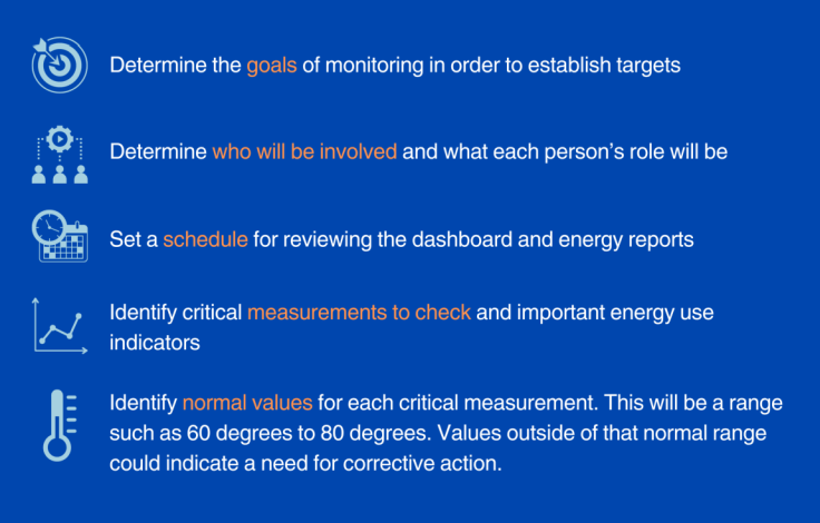
Define goals
The first step to any successful project is to clearly define short and long-term goals and establish the intended outcomes with agreement from all stakeholders. Ensuring that everyone is working towards a shared vision or outcome will align the next steps of the project towards that goal.
Benefits of a Stakeholder Meeting
Often it is useful to hold a meeting or a series of meetings in which all parties involved discuss the needs of the organization, challenges to overcome, and how monitoring can be useful. This is a good stage to uncover differences of opinion and agree upon the goals of the project in writing so that the agreement can be referenced later in the project to stay on course. The goals should be detailed and have steps to break up the work involved as well as metrics to define a successful project.
For instance, if the goal is saving energy it would be best to write down the percent reduction or the total BTUs, gallons, or kWhs to be saved. Also, how will energy be saved? A specific goal with detailed targets will help keep everyone working towards something achievable. If the goal is preventing freeze-ups then the strategy to achieve that goal will be different from an energy saving strategy.
Even though these steps seem obvious, writing down goals, steps to follow, and metrics to assess progress will help focus the project and lead to more successful monitoring projects.
Establish a baseline
It is important to establish a baseline for the operations of a building or facility before making changes to settings or equipment. A baseline can be determined through logging utility bills or receipts at a monthly scale and by observing measurements if and once they are available.
The baseline will change throughout the year so collecting two or more years worth of electric and fuel use data from the utilities will help determine how much the baseline changes seasonally. Often the general patterns of energy usage are known but the details may be surprising.
Once monitoring is in place, regular reviews of the past week’s data helps identify periods of high usage or anomalies that could be opportunities to save energy. It is critical to establish an understanding of who will be responsible for checking the system and who will be notified of the status. In the next step, some considerations for establishing a strategy are discussed.
Identify a monitoring strategy
In order to achieve the goals of monitoring, a strategy must be laid out such that the steps can be followed by everyone involved and anyone who comes later. Your strategy may evolve after data is collected and need to be adjusted during critical times, cold weather, wind, humidity levels, and occupancy.
Key Steps to an Effective Monitoring Strategy
Each component should be agreed upon by the team and written down. The monitoring strategy should be available to each member of the monitoring team.
Implement improvement actions
Areas for improvement will vary for each installation and should be documented in the monitoring goals document. Sometimes it will take a year to determine the best options for improvement and sometimes the solution will be clear after only a few days or weeks of monitoring. The key is to stick to the goals that were originally expressed and tackle those first. Make small changes to schedules, temperature setpoints, etc. and check that an improvement has occurred in the monitored variable before making larger changes. Also make sure that any changes haven’t caused other unintended consequences, and that they are logged before continuing.
Verify results and adjust strategy
Once the operational schedule and/or setpoints have been modified it is important to monitor the building from a data standpoint and a physical standpoint to make sure that the changes are acting as intended. This means reviewing the data to make sure that the changes are as expected and are not causing adverse effects. For instance, if morning warm up times have been delayed to save heating fuel, is the building reaching operating temperature by the time employees arrive? Often warmups are overly aggressive to make sure that the building achieves a comfortable temperature long before employees arrive and savings can be found by delaying or reducing the warmup sequence. If this is the case, the building must still come up to an acceptable temperature by the time employees arrive so verification is necessary to be sure that this is happening.
If changes result in conditions that are unacceptable, first modify the changes before going back to the original operational protocols.
Analyzing Data
Collecting and analyzing data can reveal ways to save energy, improve maintenance, and avoid equipment failures. This section describes different analysis tools available in BMON.
Overview of BMON Tools for Data Analysis
There are essentially three types of tools in BMON that assist with data analysis:
-
General Graphs and Reports: Choose from among several graph and report options for displaying sensor data by sensor type, time period, and other options and configurations. See Graphs and Reports to learn how to create the most commonly used graphs and reports.
-
Custom Reports: This feature allows you to store frequently used graph configurations. See Custom Reports to learn how to create your own custom reports.
-
Energy Reports: BMON generates daily energy reports that can help identify potential energy saving opportunities. Energy reports are accessible through the BMON interface and further discussed for each Important Sensor in Analysis of Energy Data by Sensor.
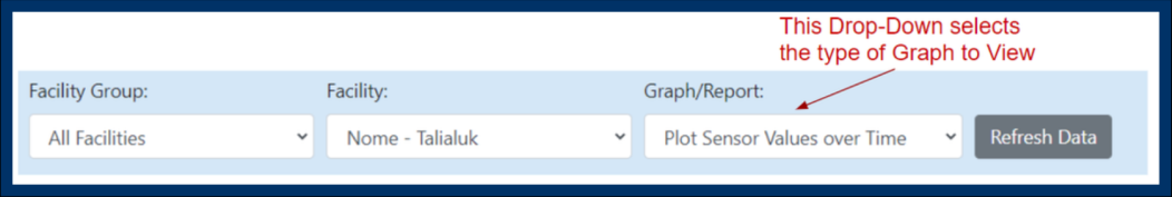
Graphs and Reports
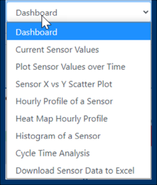
This section focuses on the most commonly used Graphs/Reports to view in BMON, accessed through the top menu bar titled “Graph/Report.” Once there, select the type of Graph or Report to view from the drop-down menu provided.
Drop Down Menu in the Graph/Report Tab That Allows Selection of Available Data Visualization Tools
Common Graphs and Reports
Listing of the Most Common BMON Graphs and Reports

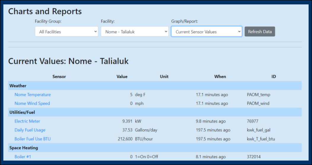
Current Sensor Values
The “Current Sensor Values” report shows all the sensors assigned to a building and gives the most recently reported value for each sensor. The report also shows how long ago that value was reported to the system; this is useful for identifying sensors that have failed as their last reported value will be from a day, week, or even month ago. The Current Sensor Values report will also show sensor values highlighted red if they are triggering an Alert.
The top portion of a Current Sensor Values report (showing the sensor name, most recent reported value and units, the time of the last reported value, and the sensor ID)
Plot Sensor Values over Time
Example of a Plot Sensor Values over Time Graph Used to Measure
Temperature of Selected Building Areas over a Period of Months
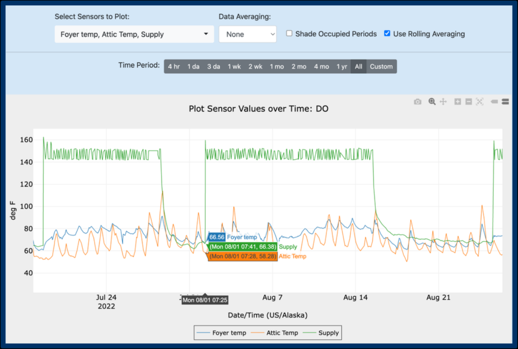
The “Plot Sensor Values over Time” graph is used to plot the values from one or more sensors over time. There are a number of special features of this graph, such as zooming and averaging, which are explained in the following video.
Video: Plot Sensor Values over Time Graph
Sensor X vs Y Scatter Plot
Example of an X vs Y Scatter Plot Used to Measure the Correlation
Between Fuel Use and Outdoor Temperature
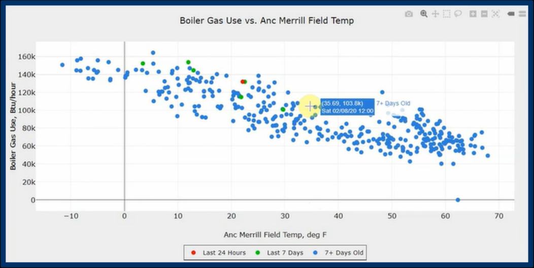
The X vs Y Scatter Plot allows you to see how two different sensor values relate to one another. For example, plotting boiler gas use vs outdoor temperature can reveal days with excessive fuel use. This below video shows how to use X vs Y Scatter Plots.
Video: Sensor X vs Y Scatter Plot
Hourly Profile Plots
Example of an Hourly Profile Plot Used to Measure Differences in a
Building’s Electric Use on Occupied and Unoccupied Days
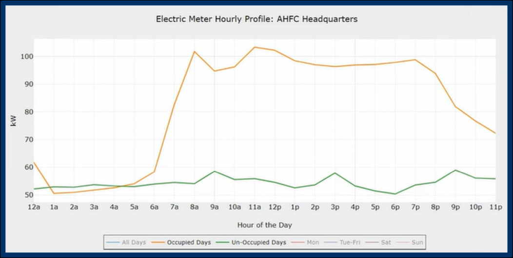
Another useful plot called the “Hourly Profile of a Sensor” helps show how a sensor reading varies depending on the hour of the day and the day of the week. Here is a video explaining this plot, and also briefly showing the related “Heat Map Hourly Profile” chart.
Video: Hourly Profile Plots
Additional Graphs and Reports
A brief overview of all the other available Graphs/Reports is given in the video below.
-
Histograms
-
Cycle Time
-
Download to Excel (downloads data as a .csv file)
Video: Overview of Other Available Reports/Graphs
Custom Reports
If you would like to combine one or more of the above graphs into one report and be able to easily rerun the set of graphs, Custom Reports are the solution. This video shows how to set up and run a Custom Report.
Video: Custom Reports
Energy Reports
The rest of this section walks through each important sensor and shows how to analyze the data provided by that sensor, with the goal of finding energy saving opportunities.
Indoor Temperature Sensor Data Analysis
The “Indoor Temp” Energy Report provides the information you need to identify energy saving opportunities such as inefficient temperature setpoints and failure to change heating and cooling setpoints during unoccupied periods. Indoor temperature data can also alert you to heating system failures, which can cause substantial damage due to frozen pipes, for example. Click below to learn more about using indoor temperature data and how it can inform making building changes.
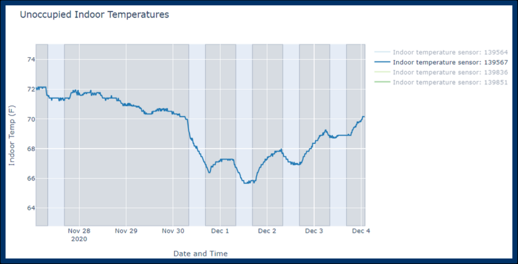
Example of an Indoor Temp Energy Report
The “Indoor Temp” Energy Report provides the information you need to identify these energy saving opportunities. The first graph in the report shows indoor temperatures for the past week and highlights the unoccupied periods when those temperatures should be lowered during the heating season. In the Energy Report, these graphs are “live,” meaning you can hide and show lines by clicking on items in the legend, and you can zoom in by clicking and dragging a rectangle on the graph. The graph below shows an example where only one sensor has been highlighted. The gray areas on the graph are the unoccupied periods for the building.
Indoor Temp Report in the Energy Reports Section of BMON

Settings for Unoccupied Periods
To save energy, the heating temperature setpoint should be reduced during unoccupied periods. For this building, you can see that temperature reductions are occurring during those unoccupied periods. Zooming in on December 2 of the graph below, it looks like the morning warm-up period was set to begin earlier than needed and the evening set back began later than needed. The space is up to occupied temperature at 5 am and then is not set back again until 9 pm. There may be good reasons for this extended schedule, but it is worth investigating.
A Closer View of the Indoor Temp Report

Temperatures during the gray, unoccupied periods are often higher than they are during occupied periods. There appears to be a controls or heating system problem in this building, and investigation is warranted. The figure below is an indoor temperature graph from the Energy Report of a space in a different building.
Indoor Temperature Report Displaying a Potential Problem in a
Building’s Heating Pattern
The second graph in the “Indoor Temp” Energy Report shows if indoor temperatures are excessive during the heating season. The graph below shows a sample graph utilizing this highlighting feature for temperatures outside of the generally accepted normal range.
Temperature Energy Report Feature That Alerts Users of Indoor
Temperatures Outside the Normal Range
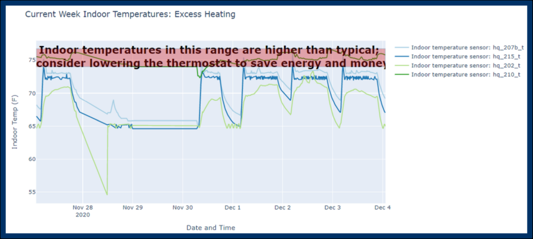
The red horizontal bar marks a heating temperature range that is generally beyond that needed for comfort. Although it is a bit hard to see, there is one indoor space temperature that spends most of its time in that high range and therefore indicates a possible opportunity for energy savings.
As mentioned before, drops in indoor temperature can indicate a heating system failure and possible freeze-up. The best way to “analyze” the sensor data to address these problems is to set up Alerts, as described on the Setting Up Your BMON System page.
Light Level Data Analysis
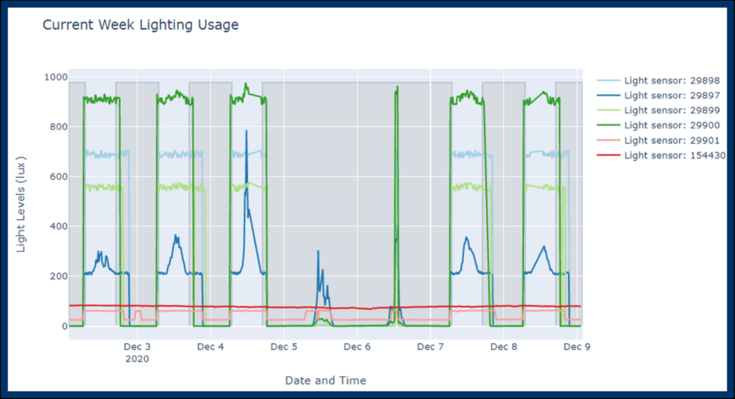
The primary purpose of the light sensors is to see whether the operation hours of the lights are consistent with when spaces are occupied. Although light sensors do give you a reading of the actual light level in lux, “the sensors are limited in their ability to accurately determine the appropriate level of lighting. However, their usefulness applies to analyzing lighting during unoccupied periods versus occupied periods, as explained below in the graph, where lights are on when the building is unoccupied.” This comes from the “Lighting” Energy Report. The light level lines make it clear when the lights are being operated. As was stated in the prior section for the Indoor Temperature report, the gray shaded areas are the unoccupied periods of the building. If lighting is On during a substantial part of these periods, it is worth investigating whether the control schedule can be tightened up.
Lighting Energy Report Showing Several Light Sensor Patterns Through a
Week
By double-clicking on a sensor in the graph legend, you can isolate and show just one of the sensors. Double clicking on the chart area once a single sensor is displayed (Light Sensor 29897), as seen in the graph below, brings all the sensors in the report back.
Lighting Energy Report Showing a Single Light Sensor
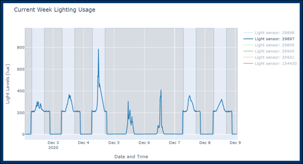
The pattern of this single light sensor may indicate lights being used on weekends or may indicate daylight to a work space. Daylight studies can help inform proper lighting and/or light dimming during daylight hours to achieve effective illumination without wasting energy.
Using the Heat Map Hourly Profile to Analyze Lighting Data
In the Common Graphs and Reports, one of the available plots is the “Heat Map Hourly Profile.” This chart type is particularly useful for analyzing lighting data. This graph shows a sample of the chart for one light sensor. The color intensity indicates the lighting level of a particular hour during the week. Notice that the horizontal axis shows hours of the day and the vertical axis shows days of the week.
“Heat Map Hourly Profile” for One Light Sensor at AHFC Headquarters
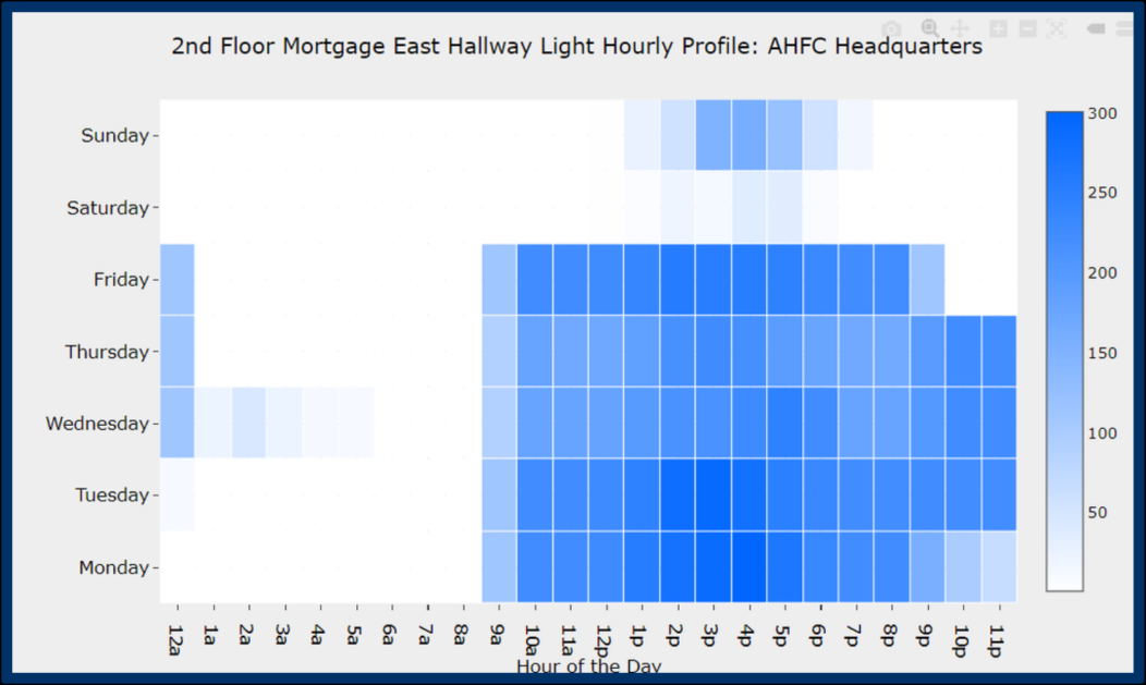
On Monday through Thursday, this space is lit until 9 pm at night. While there may be a legitimate explanation for lights staying on this late, this schedule is worth investigating further. This space has lights off for most of the weekend except Sunday afternoon. During the week however, the chart indicates that lights are often on until midnight. Reducing weekday lighting operation hours may be a good energy saving opportunity.
Another noticeable feature of this graph is the amount of daylight received by the space. The large peaks in light levels occurring during the middle of the day indicate that lots of daylight is present in the space. It is possible that installation of daylight-responsive dimming controls on the lights would be a cost-effective project.
Electric and Fuel Use Data Analysis
Energy saving efforts help reduce a building’s electricity and fuel use. Measuring electricity and fuel use provides important data on where energy can be saved and helps verify and track savings from energy efficiency improvements.
Examples of Energy Reports That Focus on Displaying and Analyzing
Electric and Fuel Data
Instead of walking through these reports in detail, we will try to explain the general analysis approaches used by these reports. Click on the topics below to learn more about electricity and fuel use analysis.
Comparisons of Current and Past Data of the Same Building
One way to identify energy-related problems in a building is to compare current building electricity or fuel use to prior energy use. If current use is higher, you may want to investigate what caused this increase.
If you are looking at fuel usage, it is often important to adjust for outside temperature when you do the comparison, because fuel is generally used to heat the building, and heating needs will vary with outdoor temperature.
Ways to Compare Fuel Use and Account for Outdoor
Temperature
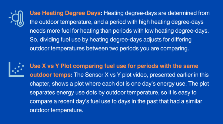
These electrical and fuel use comparisons can identify that an energy use problem is occurring, but they do not give much help in determining what the problem is. One thing you can do with this type of analysis is to determine what date the problem started occurring; this may help narrow down the cause of the problem.
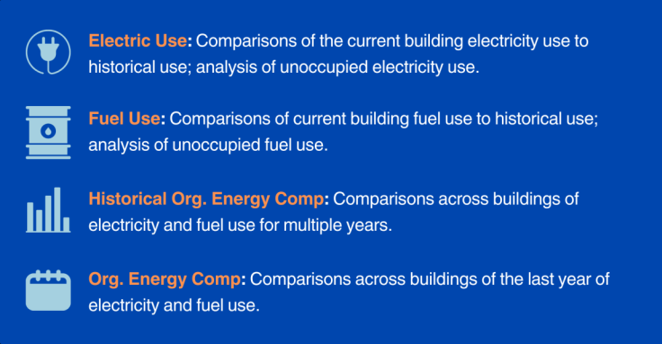
Analyzing Unoccupied Energy Use
One of the most cost-effective ways to save energy is to reduce the energy use of a building during the hours when it is unoccupied. No occupants are in the building, and there is little value to using energy beyond the bare minimum required for low-level heating and security purposes. The “Electric Use” and “Fuel Use” Energy Reports have a couple different graphs that allow you to identify excessive energy use during unoccupied periods.
What to Look for When Diagnosing High Energy Use in an Unoccupied
Building
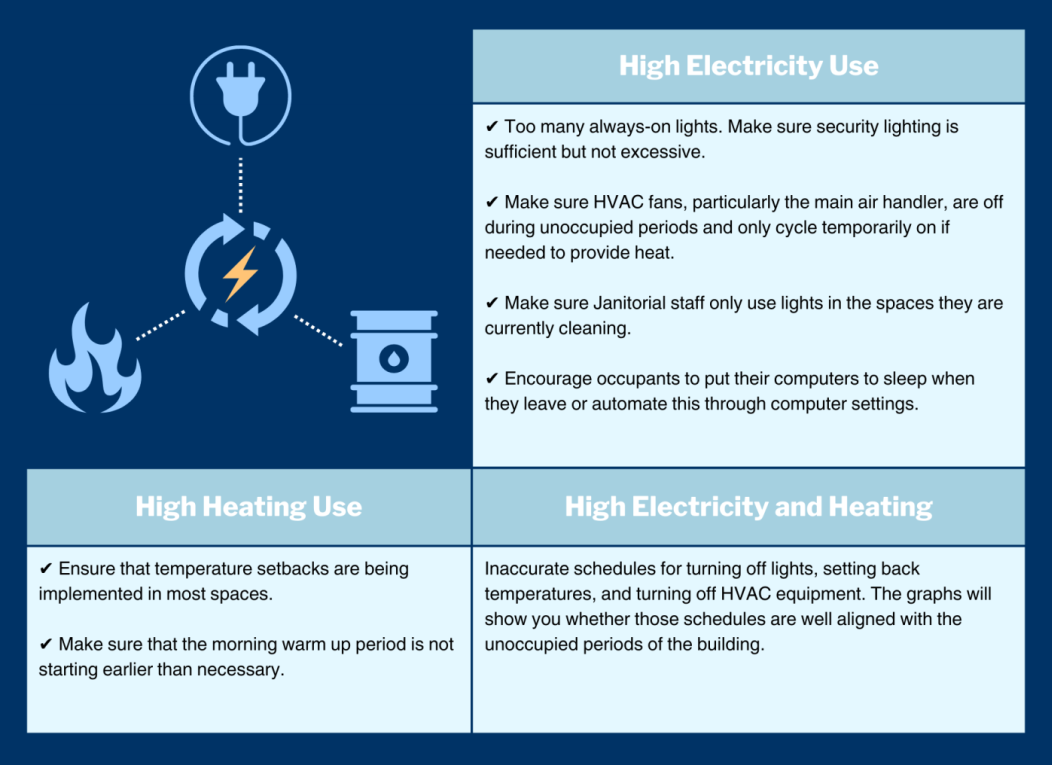
Advanced Considerations
Hire an electrician to identify electrical circuits at the breaker box that show high usage during unoccupied hours. Then, track down the equipment on those circuits that is causing the high usage. For heating, make sure that the outside air ventilation is stopped during unoccupied periods. Disclaimer: stopping outside air needs to be done carefully in conjunction with trained professionals, not just based on sensor data.
Compare Each Building’s Energy Use to Similar Buildings
Both the “Historical Org. Energy Comp” and the “Org. Energy Comp” Energy reports compare energy use across different buildings using total Electricity kWh or total Fuel BTUs. This type of comparison identifies the buildings that are large users of energy. Since buildings vary in size, comparing energy use per square foot standardizes data and allows for more direct comparisons of energy use across buildings. This type of comparison helps to identify the buildings that most efficiently use energy, since size is removed from the analysis. High use per square foot, relative to other buildings, indicates inefficient use of energy and should be investigated.
The “Historical Org. Energy Comp” report also shows the trend in energy use over multiple years, if data is available. An upward trend in energy use is a concern and should be investigated.
For both of these reports, you can use the “Organization” drop-down at the top of the page to filter the buildings that are included in the analysis. Any one organization can be selected, or “All Organizations” can be chosen to compare across buildings in all organizations.
Boiler and Domestic Hot Water (DHW) Temperature Data Analysis
Two useful temperatures to measure in a building are the boiler supply temperature, if the building utilizes a boiler, and the supply temperature of the domestic hot water. Boiler supply and return temperatures, as well as domestic hot water supply temperatures, can give indications about the amount of energy that is being consumed to heat the building and provide hot water.
Is Your Building Boiler Being Used for Space Heating
If the building boiler is being used for space heating, the boiler supply temperature should utilize an “outdoor temperature reset” control strategy. When it is very cold outside and space heating demand is large, the supply temperature needs to be highest so that hydronic heating units provide the most amount of heat. At warmer outdoor temperatures, the boiler supply temperature can be lowered, which will save energy. At lower supply temperatures, standby losses from the boiler are reduced, and condensing-type boilers will be able to condense more flue gas and operate more efficiently.
As the temperature drops, the supply temperature should rise and vice versa. The difference between the supply and return temperatures (known as delta-T) is related to how much heat is delivered to the space as the hydronic fluid circulates.
Sensors Over Time Plot with Supply, Return, and Outdoor Temperature
Can Show if an Outdoor Reset is Working

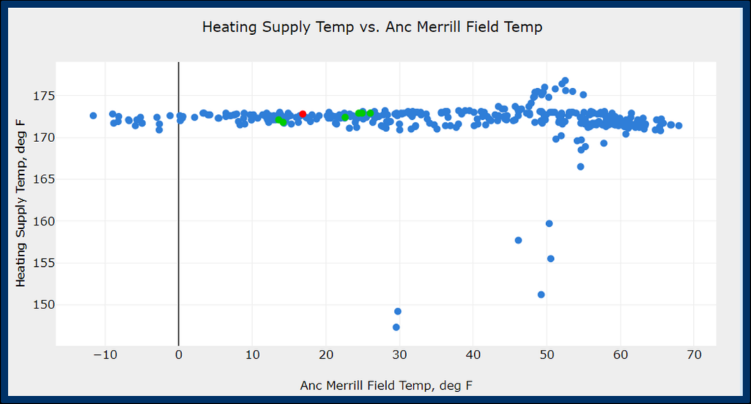
Using the X vs Y Plot to Verify Outdoor Temperature Reset
The BMON Sensor X vs Y plot is a good way to verify that the outdoor temperature reset is working. On the horizontal X axis, plot Outdoor Temperature, and on the vertical Y Axis, plot boiler supply temperature. Use one day averaging to smooth out the data. The graph below shows an example of a building that has an outdoor temperature reset:
X vs Y Scatter Plot Showing a Boiler with an Outdoor Reset Curve
Applied to the Supply Temperature Controls

Clearly the boiler supply temperature rises with colder outdoor temperatures. The shape of this relationship can be changed through the boiler controls. Maximum boiler temperature should be reached at a temperature near the heating design temperature for the building. Minimum temperature should be near 60 degrees F outdoor temperature, a temperature where the building should require little space heating.
Measuring Boiler Temperature for Alert of Failure
The graph below shows a building where outdoor temperature reset is clearly not being used. There is no relationship between the outdoor temperature and the boiler supply temperature:
X vs Y Scatter Plot for a Heating System Without an Outdoor Reset
Curve
The X vs Y scatter plot for this heating system does not have an outdoor reset curve because the supply temperature remains essentially constant at the range of outdoor temperatures.
Measuring boiler supply temperature can also be used to alert you when there is a boiler failure. The supply temperature will drop below reasonable levels, and a BMON Alert can be set up to notify you when this occurs.
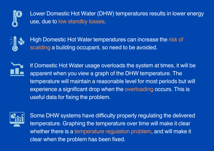
Why Measuring Domestic Hot Water Supply Temperature is Useful
CO2 Sensor Data Analysis
Carbon dioxide (CO2) sensors are useful for determining the amount of outside ventilation air that a space is receiving relative to the number of occupants in the space. From the levels of CO2 measured by the sensors, you can roughly determine whether a space is receiving too much outside air, which causes higher heating energy use, or too little outside ventilation air, which causes poor indoor air quality.
Ventilation and Viral Infections
During periods when infection rates of airborne/respiratory viruses (such as COVID-19 or Influenza) are significant, outside air ventilation reduction is not appropriate, since exhausting building air to the outdoors helps remove airborne viruses from a building. Statements in the rest of this section suggesting reduction of outside air ventilation rates are only appropriate if airborne virus infection rates are under control. Visit CDC ventilation recommendations for more information when considering this issue.
Indoor Air Quality (IAQ) Energy Reports
Although it is difficult to tell from just looking at CO2 levels, it is very important to make sure that mechanical outside air intake is shut-off or minimized during the unoccupied hours of the building. There is no reason to ventilate an unoccupied space, and doing so can consume large amounts of energy. For most non-residential buildings, the total number of unoccupied hours for a building is greater than the number of occupied hours. Many hours of wasted heating energy will occur if the outside air ventilation is left running.
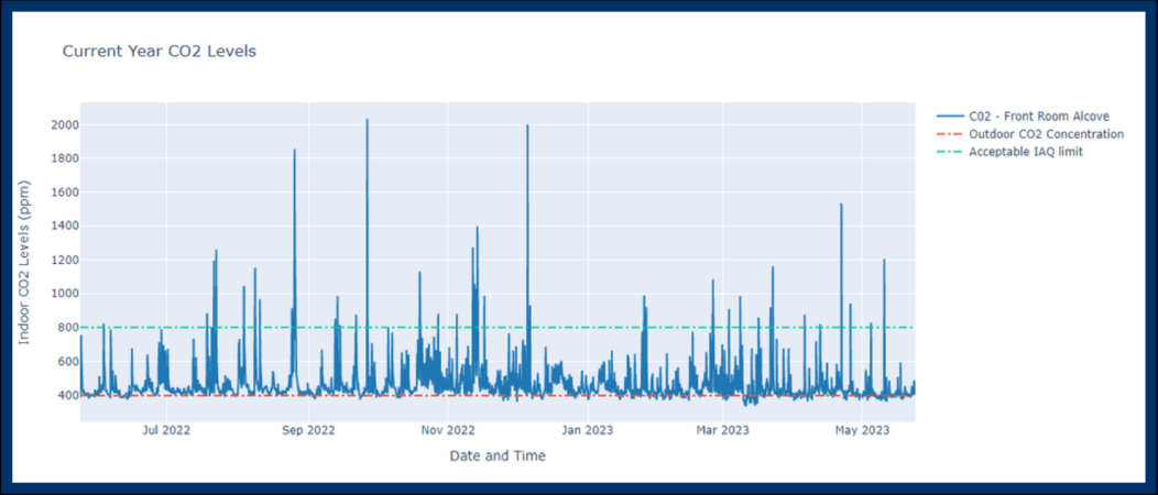
The “IAQ” (indoor air quality) Energy Report provides a graph that can be used to see if building spaces are being ventilated properly. This shows that the CO2 generally stays below 800 ppm but occasionally goes well above that level, indicating that the building has adequate ventilation but it probably responds to higher occupancy by staying at a constant level all the time rather than ramping up. It’s a good idea to have a control strategy in place that relies on occupancy sensors or CO2 measurements to increase/reduce ventilation when occupancy drops.
Example of an IAQ Energy Report
Recommended CO2 Levels
CO2 levels are measured in parts per million (ppm). Outside air has a CO2 level of about 400 ppm. In an occupied building, people exhale CO2 and the level of CO2 in the building rises above outside air levels. If there are many people in the building and low levels of outside air exchange (either through natural air leakage or through mechanical ventilation), CO2 levels can rise to high levels, levels far in excess of 900 ppm, for example.
The CO2 level in a building space is a good indicator of the amount of outside air exchange per person in the space. CO2 levels above 900 ppm indicate that there is probably not enough outside air exchange, and mechanical ventilation should be increased for that space. CO2 levels below 900 ppm indicate that more air exchange is occurring than is needed for proper ventilation (except in times of high airborne virus infection rates, like COVID-19). Tightening the building shell and/or reducing mechanical ventilation in that scenario will save space heating energy use while still maintaining adequate indoor air quality. All of the building’s CO2 sensors are shown on the graph and can be easily compared to the 900 ppm threshold. The CDC recommends 800 ppm, however sometimes sensors drift, causing the actual concentration measurement to be inaccurate. Aim for 400-600 ppm above outside levels of around 400 ppm. This means that 800-1000 ppm would be about right for most buildings, keeping in mind that it is a subjective target that depends on many factors.